Archivi autore: tomaso64

MINSK DESIGN WEEK 2019


Il 1 maggio inizia la mostra internazionale del design Minsk Design Week 2019!
La Design Week di Minsk riunirà designer e architetti di tutto il mondo. Nei 10 giorni dell’evento  la Città Alta si trasformerà interamente in uno spazio espositivo con padiglioni, esposizioni e installazioni.
Quest’anno, la settimana del design si concentra in un formato non standard: interdisciplinarietà, integrazione, collaborazione, interattività e partecipazione attiva dei visitatori.
Tomaso Marcolla partecipa con 2 nuovi progetti dal titolo “Cubo” e “Prato prensile” ed una esposizione di poster.

MINSK DESIGN WEEK 2019
The launch of the international exhibition Minsk Design Week 2019 will take place on the 1st of May!
Minsk Design Week will gather designers and architects from all over the world. During these 10 days territory of the Upper Town will become an exhibition space with pavilions, expositions and installations.
It’s a worldwide conception aimed at bringing people together to share recent achievements in the field of design and to introduce innovations.
This year Design week will not follow the usual format but will show interdisciplinary approach, integration, collaboration, interactivity and active involvement of visitors.

Minsk, Belarus – Bielorussia – Città alta – dal 1 al 10 maggio 2019

Sfoglia i depliant descrittivi distribuiti presso Minsk Design Week 2019!
https://issuu.com/tomasomarcolla/docs/cubo
https://issuu.com/tomasomarcolla/docs/prato
https://issuu.com/tomasomarcolla/docs/poster

Questi sono i pannelli (cm 100×140) esposti presso i padiglioni della mostra.

PRATO “PRENSILE”
Rinverdiamo i luoghi della città, gli spazi ormai invasi da cemento e asfalto non lasciano spazio all’erba. Inseriamo dei “tasselli” di natura, di verde.
Un prototipo di “prato prensile” una struttura formata da una base di materiale naturale (legno) con dei supporti di contenimento ai bordi, dove si colloca la terra seminata a prato.
La collocazione di questi “tasselli” in determinati luoghi, caratterizzati dall’assenza di spazi a verde, strutture sospese mediante cavi sottili di acciaio, la natura che conquista non più il terreno ma lo spazio. L’erba che viene eliminata anche dagli interstizi dei muri, dei marciapiedi, allora si vendica e crea un mondo sospeso sopra di noi, dove nessuno la calpesta.
La forma triangolare con angoli acuti fatta per incunearsi negli spazi.
La successione temporale, semina, crescita, morte scandisce il trascorrere della vita ed il naturale accadimento, non determinato dalla volontà umana.
PREHENSILE MEADOW
Make cities green again, spaces now invaded by cement and asphalt leave no room for grass. We must insert “plugs” of nature, of green.
A “prehensile meadow” prototype is a structure created on a base of natural material (wood) with containment supports on the edges, where sown land is placed.
The placement of these “pieces” in specific places, characterized by the absence of green spaces, structures suspended by thin steel cables, nature that no longer conquers land but space. Grass removed also from the interstices of walls, sidewalks, then takes revenge and creates a suspended world above us, where no one can step on it (that no one can tread).
The sharp angles of the triangular shape are made to wedge spaces.
The temporal succession, sowing, growth, death, marks the passing of life and the natural occurrence, not determined by the human will.


“Contenitore di morte, un proiettile per ciascuno di noi”.
Un cubo, per l’esattezza solo le 4 facciate laterali, con un lato semiaperto che permette l’entrata del visitatore.
L’esterno, sui quattro lati, appaiono dei proiettili puntati verso lo spettatore. All’interno vi sono le immagini dei bossoli con incisi i nomi più diffusi delle varie popolazioni (Rossi, Johnson, Abdelaziz…), così da poter pensare che anche il nostro vi possa comparire.
I bossoli hanno già un destinatario, ordinatamente in fila come delle lapidi in un cimitero. La guerra, visualizzata nei proiettili, non risparmia nessuno.
La stampa direttamente su dei pannelli di m 2×2 in Forex dello spessore minimo di 3 cm circa.
I pannelli in forex devono essere fissati tra loro mediante supporti metallici “a L” e viti.
Per una suggestiva esposizione, l’illuminazione dell’interno si dovrebbe realizzare con una luce “spot” che illumina solo la parte centrale di ogni lato, così da sfumare gli altri creando un effetto di continuità.
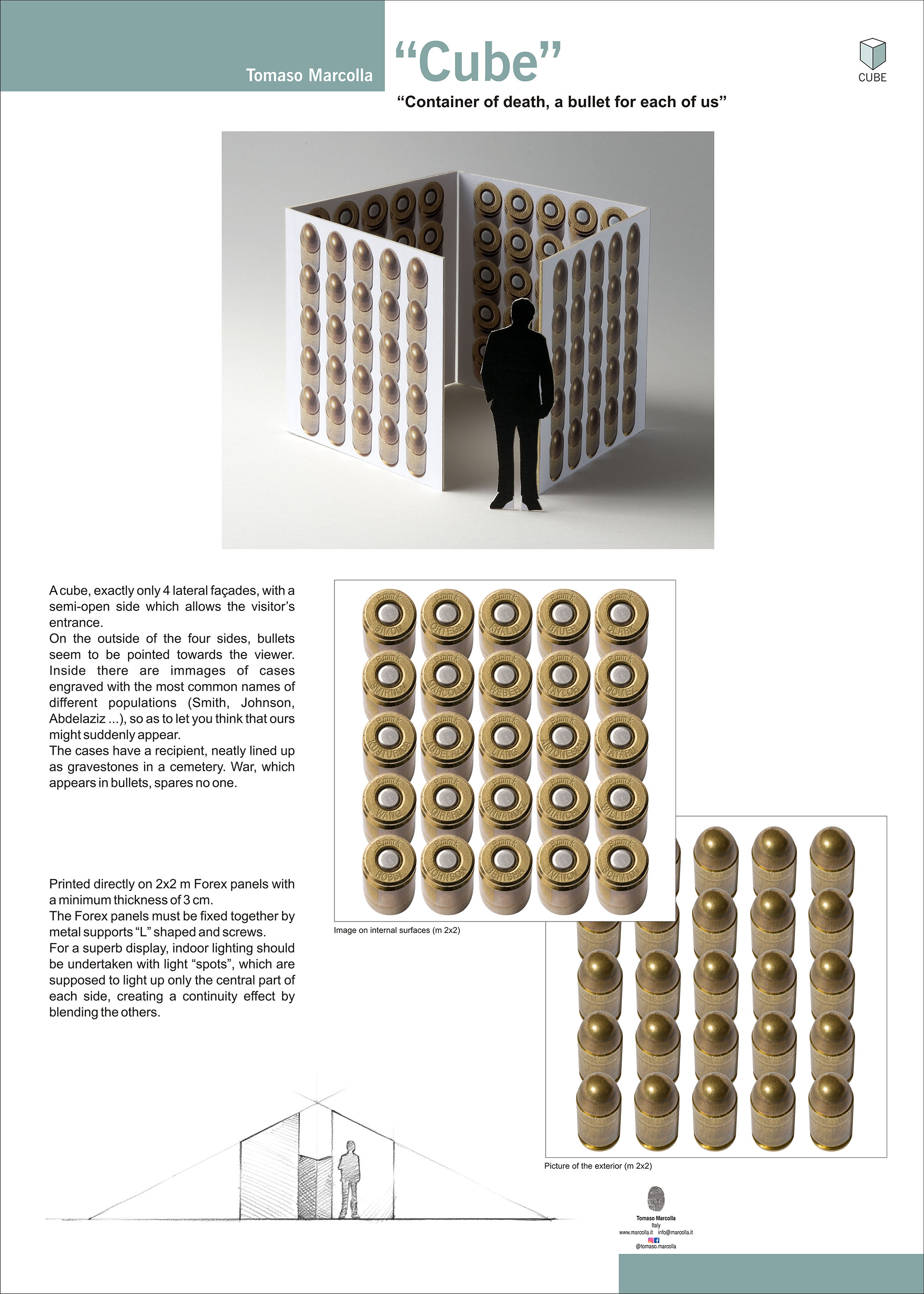
Container of death, a bullet for each of us
A cube, exactly only 4 lateral façades, with a semi-open side which allows the visitor’s entrance.
On the outside of the four sides, bullets seem to be pointed towards the viewer. Inside there are immages of cases engraved with the most common names of different populations (Smith, Johnson, Abdelaziz …), so as to let you think that ours might suddenly appear.
The cases have a recipient, neatly lined up as gravestones in a cemetery. War, which appears in bullets, spares no one.
Printed directly on 2×2 m Forex panels with a minimum thickness of 3 cm.
The Forex panels must be fixed together by metal supports “L” shaped and screws.
For a superb display, indoor lighting should be undertaken with light “spots”, which are supposed to light up only the central part of each side, creating a continuity effect by blending the others.


Una collezione di immagini che tracciano un percorso attraverso il senso dell’umorismo e della satira della nostra società, il lavoro di Tomaso Marcolla si concentra su temi presi dalla vita contemporanea, alcuni dei quali sono molto stimolanti e drammatici. Come fumettista satirico e caricaturista, l’autore sottopone il contenuto dei suoi cartoni a un’interpretazione ironica e provocatoria, esprimendosi sempre con i linguaggi della grafica digitale e della fotografia che gli sono familiari come artista e designer.
A collection of images that pick a path through our society’s sense of humour and satire, Tomaso Marcolla’s work focuses on themes taken from contemporary life, some of which are highly thought-provoking and dramatic. As a satirical cartoonist and caricaturist, the author subjects the contents of his cartoons to an ironic, provocative interpretation, always expressing himself with the languages of digital graphics and photography that are familiar to him as an artist and designer

Poster Monday: Peace Negotiations

For this Poster Monday spot we have the work of a previously presented designer; Tomaso Marcolla and his first poster awarded for a competition “Peace Negotiations”. He started working as a graphic designer in advertising agencies since 1985.
“My job consisted of the classic role of the graphic designer, from the creation of a company logo to the advertising campaign, to video commercials, etc. Parallel to my profession, I carried forward what was my passion that I initially developed by creating satirical cartoons. The first prize I receive at a comic competition in the Municipality of Genoa dates back to 1996. Later I started to create posters especially for charitable associations and to raise awareness on social issues. My first poster awarded for a competition was called “peace negotiations” and dates back to 1999 and is made in pen on paper. The last prize, in order of time, is the bronze medal in the international competition “Ecuador Poster Biennial” in the poster section on the theme “Donald Trump” entitled “The wall” and is entirely made in digital”.
“Having an artistic education, in fact I graduated from the institute of art, my posters are often a contamination, a collage of traditional artistic techniques (drawing, watercolor, etc.) with digital computer intervention. The themes that I tackle in my posters are the values ​​that characterize my daily life such as solidarity, nonviolence, the defense of the environment and so on. That, linking up with current events, I try to represent in an original way that makes me curious, think and reflect. They are often surreal visions, the cow with the straitjacket (mad cow), the pig that shoots projectiles (swine flu), a cross between a sheep and a cauliflower (GMO), a drop of blood that forms the flag of Japan ( in memory of the tragic events that hit Japan in 2011). The first vignettes are born in the 90s and were made with traditional techniques, watercolor, pen, collage (mad cow). The technique has subsequently evolved with the spread of “digital”. Change the technique of realization but the inspiration always comes in the same way: a news of current events, a social problem, a fact that strikes me particularly. Later I try to represent, to intrigue, to make people reflect, in a non-violent way, even on topics that are often tragic”.

“I consider digital art as a different form of art, with some communication possibilities peculiar to more traditional art forms. The choice of the medium in fact always depends on “how” and “what” I want to communicate. However, I remain always fond of traditional techniques (watercolor, acrylic, oil, collage) that I love to experiment and that, unlike computers, offer direct contact with the work”.

http://www.posterposter.org/poster-monday-peace-negotiations/

Trattative di pace, 1999, disegno e computer grafica, cm 50×70
poster selezionato alla mostra sul manifesto di pubblica utilità
AIAP – “Manifesto dissenso” 1999 – Comune di Montescaglioso (MT)

Graphic Front

Tomaso Marcolla – Social and Political Values Right Under Our Skin

Without the invention of portable paint tubes, van Gogh would have kept on painting dull potatoes in Holland, and not the southern French outdoors. Without silkscreen printing, Andy Warhol would have remained Andrew Warhola. Technology has always pushed the artist’s vocabulary into previously unknown languages.

Pixels are now replacing paint to suit to the frenzy of our times. Starting out in the 90s by doing collages, internationally awarded artist Tomaso MARCOLLA went digital for the speed of realization. Time is of the essence. Digital art spread via the internet has this desired effect of immediacy. It is the now that counts.

“It’s like having a printer directly connected to my brain.”

Clearly, Marcolla’s brain is, in its turn, connected to the issues of our troublesome humanity: freedom of speech, gender inequality, violence and abuse, economic crisis, solidarity, the preservation of the environment. His works speak for those that are silenced.

Boot imprints walking over the female sign (gender discrimination), or the spanked piggy bank with a cross-shaped hole (economic and religious crises) let the importance of social and political values right under our skin. The latter has been published recently by the French publication L’Humanité to mark its 50th anniversary.

Since he started creating posters, his technique changed, but the inspiration is the same: the news, a social issue, a fact that particularly appeals to him. Marcolla aims to make us reflect, in a surrealistic, non-violent fashion, upon the ills of our times: the crossing between a cauliflower and a sheep (GMO), bullet figure eating out a pencil (freedom of expression).

In 2014, Editioni iod published a book with a considerable collection of Marcolla’s works, some of them bearing international awards. POSTER is a testimony to the artist’s heart and creative quest, a treasure that should belong to any contemporary art lover’s home.

Marcolla lives and works in Trento, the town where he was born in ’64 and studied arts later on. His works caught attention during the past years. 2015 saw five of his works selected along ten other artists and published in the volume 1000 crayons pour la liberté d’expression, in memory of the terrorist attack on Charlie Hebdo in Paris. An incident, which makes artists’ voices like Marcolla’s even more important.

More here marcolla.it

Article by Cynthia Loris

https://www.graphicfront.ro/blog

Writers Resist: The Anthology 2018

Su invito di Kit-Bacon Gressitt ho inviato la mia opera digitale “The Wall” che è stata pubblicata sul libro Writers Resist: The Anthology 2018.

Contiene le opere di 73 collaboratori, tra cui, alcuni noti scrittori e artisti internazionali.

WRITERS RESIST: THE ANTHOLOGY 2018

Editors: Kit-Bacon Gressitt and Sara Marchant
Pubblicazione: 1 ottobre 2018
Running Wild Press
– 259 pagine, 5 illustrazioni in bianco e nero, 5.5″ per 8.5″
– Trade paperback $ 19.99 • $ 10,99 all’ingrosso
– ISBN 978-1-947041-13-4
– Distributore: Ingram Book Group

Acquistabile su Amazon


La noce

Tomaso Marcolla espone alla mostra
LA NOCE | VISIONI ARTISTICHE CONTEMPORANEE

Palazzo Trentini, Via Manci, 27 | Trento
6 ottobre | 3 novembre
inaugurazione sabato 6 ottobre – ore 11.00

Borgo Antico di Rango | Comune di Bleggio Superiore
7 dicembre 2018 | 6 gennaio 2019
inaugurazione sabato 10 novembre 2018 – ore 11.00
in occasione della festa della noce

L’opera esposta alla mostra dal titolo “Noci” fa parte di una sua personale “Recherche” nei ricordi familiari: i bicchieri azzurri di casa, il guanto da lavoro del padre, il “bruschin” della madre, lo scarpone da lavoro: tutti oggetti commoventi che popolavano un mondo passato e rimossi dalla memoria collettiva che meritano di essere ricordati per la loro utilità umile ma necessaria. Grazie alla capacità di riportare sulla carta con fine perizia brani del proprio vissuto, l’artista ripercorre la storia personale riscoprendo con nostalgia e affetto il valore culturale ed estetico di questi oggetti poveri e comuni.

Oggi, le sue opere sono caratterizzate da una curiosa contaminazione artistica che spazia tra grafica, arte pittorica, arte digitale e illustrazione, in un continuo interscambio tecnico-comunicativo fra attività professionale e attività artistica.

Le opere chiamate “Poster” sono il risultato di questa contaminazione di tecniche ed affrontano tematiche quali il diritto al lavoro, crisi economica, solidarietà, nonviolenza, difesa dell’ambiente. Si tratta di immagini iconiche sui grandi temi sociali, una ricerca di sintesi comunicativa ed estetica estrema capace di concentrare in una unica immagine concetti complessi e variegati e, allo stesso tempo, di esplicitare in modo chiaro anche l’impegno etico e politico dell’artista.

Servizio di Trentino TV del 5 ottobre 2018

Noci, 2018, penna a sfera e acquerello su carta, cm 21×64

“Tenir l’affiche”


“Fête de l’Humanité” 2018 – Parigi

Tra il 30 aprile e il 29 giugno 2018, il quotidiano l’Humanité ha pubblicato un poster ogni giorno a piena pagina a sostegno delle lotte sociali per celebrare i cinquanta anni dal maggio ‘68.

Questi poster saranno esposti a Parigi alla “Fête de l’Humanité” 2018, nella mostra intitolata “Tenir l’affiche”.  Poster che saranno stampati in grande formato ed esposti allo stand de “l’Agora de l’Humanité” nei 3 giorni della festa, dal 14 al 16 settembre. Ogni anno più di 500 mila persone partecipano a questo evento che si svolge a Parigi – Parc Départemental de la Courneuve.

Sarà esposto anche il poster di Tomaso Marcolla dal titolo Salvadanaio.

https://fete.humanite.fr/Tenir-l-affiche

Salvadanaio, 2008, foto e computer grafica, cm 50×70.

L’Humanité – “Tenir l’affiche”

“Tenir l’affiche”
Da aprile fino a giugno, il quotidiano francese L’Humanité pubblica quotidianamente una pagina con un manifesto politico a colori. Il progetto è opera del direttore Thomas Lemahieu ed è stato avviato per celebrare il 50° anniversario del 1968 e, contemporaneamente, per portare l’attenzione sull’aumento delle lotte sociali attualmente in corso in Francia. La maggior parte degli artisti e dei designer coinvolti sono europei.

Oggi, 15 giugno 2018, viene pubblicato il poster di Tomaso Marcolla “Salvadanaio” che rappresenta il classico maialino, con una fessura a forma di croce, ad indicare la fine dei risparmi.

Tutti i poster sono pubblicati e scaricabili gratuitamente a questo link:

http://www.humaginaire.net/

https://www.humanite.fr/

Pagina del quotidiano l’Humanité – 15 giugno 2018

Salvadanaio, 2008, foto e computer grafica, cm 50×70, poster selezionato da Thomas Lemahieu per la campagna “Tenir l’affiche, une série dans l’Humanité” – del quotidiano L’Humanité – giugno 2018

Graphis Poster Annual 2019

Il poster di Tomaso Marcolla dal titolo “Human rights” è stato selezionato per la pubblicazione nell’annuario “Graphis Poster Annual 2019” della rivista internazionale Graphis.
Il poster è stato premiato nella categoria “Social & Political” con il premio “Gold”.

Graphis è una rivista internazionale di comunicazione visiva, pubblicata per la prima volta a Zurigo nel 1944 e dal 1986 a New York. Da oltre cinquant’anni è considerata un’autorità nel campo del design, fotografia, architettura, pubblicità e illustrazione.
Oltre alla rivista ogni anno pubblica un Annual con il meglio della produzione grafica mondiale, presentando una selezione, operata da giurie di autorevoli esperti del settore. Nel 1973 nasce Graphis Poster Annual, diventando una delle migliori pubblicazioni disponibili nel suo genere.
Ciascun annuario tematico (Design, Pubblicità, Fotografia, Loghi, Branding, Poster) raccoglie in volumi illustrati di grande formato i migliori lavori prodotti internazionalmente nella disciplina, costituendo repertori di riferimento per il settore della comunicazione visiva.

Inoltre, il poster “Human rights” era stato esposto presso la sede UNESCO di Parigi in una mostra ad invito organizzata dall’associazione “Poster for tomorrow” “Uno per tutti, tutti per uno”.

Poster annual 2019
Published: 2018
Size: 8 1/2″ x 11 3/4″
Pages: 240
ISBN: 9781931241694

http://www.graphis.com/entry/f7b6b8fa-38a3-4f57-b33c-8822cf01b7cb/

Cartastraccia, 2017, fotografia, cm 70×100 Poster progettato su invito per l’associazione parigina “Poster for tomorrow” in occasione del 70 ° anniversario della Dichiarazione Universale dei Diritti Umani.